The Commerce of Giving
How reordering the e-comm flow revived years of flat revenue
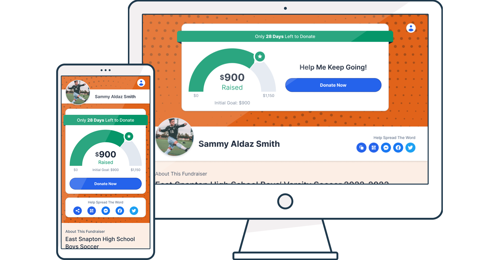
Snap! Mobile's donor experience hadn't been meaningfully updated in nearly a decade. Leadership wanted it simplified, and the instinct was reasonable: strip the friction, cut the fields, get people to pay faster. Every commerce best practice pointed the same direction.
The data pointed somewhere else. Donors weren't abandoning because the flow was long. They were abandoning because it asked for the wrong things at the wrong moments, most visibly a written message of support sitting between the donor and their payment. The problem was never the amount of friction. It was the order of it.
That reframe is the whole case. It's also why a number that had been flat for years finally moved, and why Snap! went from chasing its first million-dollar day to posting its first two-million-dollar one.
As the sole designer, I partnered with one PM on testing strategy while owning the research, competitive analysis, and design across the entire donor experience flow. Three constraints shaped the work before I drew a single screen:
Group leaders guarded donor relationships, so I couldn't interview users directly and had to design for someone I'd never meet

Leadership wanted results fast, so I couldn't wait for a full redesign and had to ship isolated A/B tests along the way to the larger MVP

The donor experience was one stage of a larger fundraising funnel, so every change had to stay coherent with the stages before and after it.
The constraint I named up front hit hardest here. I couldn't interview donors, so I reconstructed them from three signals I could measure, each answering a different question.

What they did
Open and click rates showed many never opened the invite


What they said
Donors asked group leaders if it was a scam

Where they left
Session recordings showed where they dropped


A legitimacy problem, not a checkout problem
Donors doubted the sender was real before they ever reached a form
Each signal alone was easy to misread. Low opens could look like a bad send time. A scam question could look like one nervous donor. A drop-off could look like a broken field. Together they told one story: donors weren't bouncing because the checkout was hard. They were hesitating because they didn't trust the sender. Snap! was an unfamiliar third party asking for money on behalf of someone they did know, the participant, and that gap in legitimacy showed up before the page ever loaded, in an email half of them wouldn't open.
That reframed the whole project. This wasn't a conversion problem I could solve by trimming form fields. It was a trust problem, and trust had to be earned before a single optimization would matter. Everything that followed, the team branding, the streamlined transaction, the resequenced flow, traces back to that.
The trust diagnosis told me what the problem was. Commerce told me how to solve it. Donating felt emotional, but mechanically it was a transaction: someone had to part with money, feel good doing it, and ideally give more. So before designing anything, I looked at how the businesses that are best at exactly that had already solved these problems, and mapped each pattern to a specific donor problem I'd found.

GoFundMe
Visible giving is its own motivation. For a donation page that gave donors no social context.

Apple
Strip the form to what's essential. For a checkout that asked too much, too soon.
Amazon
Sell at peak intent, right after buying. For an upsell buried too deep to convert.
Trader Joe's
A strong default beats a wall of equal options. For a gift page where nothing stood out.
Everyone agreed the flow was too long. Leadership, and every commerce best practice, pointed the same way: cut steps, shorten it, get people to pay faster.
The data pointed somewhere else. Donors weren't quitting because the flow asked too much. They were quitting because it asked in the wrong order. The old checkout made donors write a message of support before they could pay, real emotional effort demanded at the exact moment they were reaching for a credit card.
So the fix wasn't subtraction. It was resequencing: clear everything out of the path to payment, then move the meaningful moments after it, where they became opportunities instead of obstacles.
Old Flow
Generic Email Invite

Fundraiser Page
Checkout & Message of Support
HIGH DROP-OFF
Thank You
Gift purchase buried below the fold
GIFT ADDED - RE-ENTER PAYMENT DETAILS
Thank You
New Flow
Team-branded Invite
Email and/or text
Team-branded Fundraiser Page
Checkout
MESSAGE OF SUPPORT REMOVED
Supermarket Gift
Pop-up at Payment

Full Gift Assortment
If pop-up dismissed
GIFT ADDED - ONE TAP EXISTING PAYMENT METHOD
Message of Support
Other Ways to Help
Social share, alumni sign-up, and more
NO DEAD-END, ALWAYS A PATH FORWARD
The new flow isn't shorter, and that's the point. What changed is where things fall relative to the payment. The message of support moved off the payment page to after the donation was complete. Buying a gift went from a second checkout, re-entering card details, to a one-tap add-on charged to the payment already entered. Nothing stood between the donor and the transaction anymore, and the moments that used to block the path became opportunities beyond it. That resequencing, not deletion, is what moved a number that had sat flat for years.
Two goals drove the work: earn the donor's trust fast, then make giving effortless. Here's what changed, and what it moved.
The old page was deliberately generic to fit every school, which meant it felt like no one's. Group leaders could now push their team's colors across the whole experience, page, checkout, emails. It stopped looking like a faceless platform and started looking like the team.
Over 20% lift in donation page conversion, and more time on page.
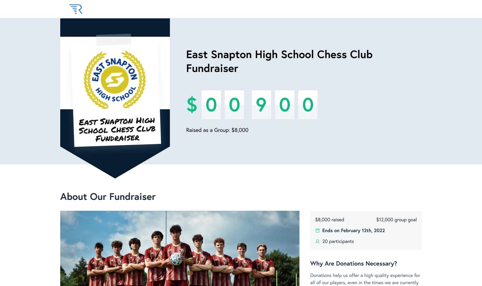
Before: Brand-neutral to fit every school, and built desktop-first
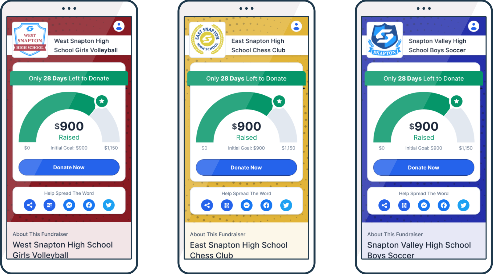
After: Team-branded and mobile-first, where most donors actually arrive
Partnering with Stripe, the card form dropped from eight-plus fields to four. Apple Pay and Google Pay then let donors skip card entry altogether.
Time on the checkout page fell by roughly a third.
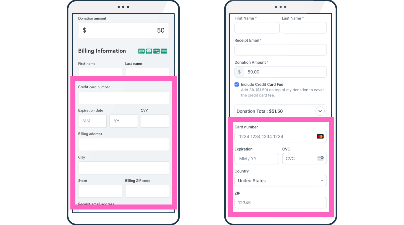
From eight-plus fields to four, partnering with Stripe
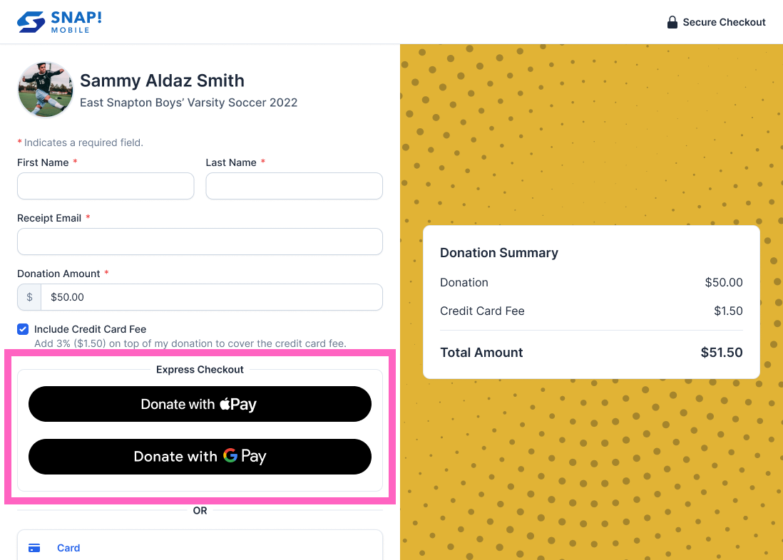
Apple Pay and Google Pay skipped the card fields entirely
Rather than sending donors to a separate gift page, the offer now appears the instant the donation completes, the moment intent is highest. One featured item, one tap, using the payment method already entered.
The post-donation gift program went from a rarely-used afterthought to a six-figure peak-day revenue driver.
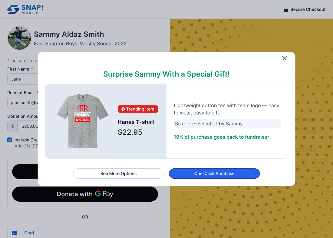
The gift offer at peak intent, one tap right after donating
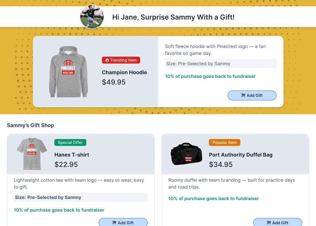
The browse path — featured product, clear badges, and transparency on where the money goes
Donors gave with no sense of where the campaign stood. Be the First set a higher opening benchmark for new campaigns, anchoring what came next.
First-donor giving rose nearly 9%.
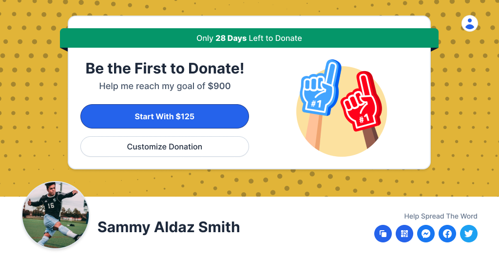
A higher opening benchmark that anchored the donations to follow
We had a full vision for the redesign, but we didn't ship it all at once. Leadership wanted results fast, so every change went out as its own isolated A/B test, measured against years of benchmark data.
That was a deliberate choice, not just good hygiene. Testing one change at a time meant I could prove which specific move drove which result, instead of shipping a bundle and guessing. It also meant every win earned the next experiment: each validated change made the next one easier to greenlight, so the redesign built momentum with stakeholders as it went.
Not everything that tested well shipped.
Beat the Champion displayed a campaign's highest donation, using competition to push the next donor higher. It worked in the data, so we iterated on it, including a podium version showing the top three gifts. But the signal that mattered didn't come from the metrics. Group leaders and sales, the people closest to these communities, raised a concern that held up: spotlighting the biggest donations could shame families who couldn't give as much, in places where everyone knows everyone. Once that feedback came in, the feature was dead, and it was the right call to kill it.
We didn't remove the idea, we relocated it. We gave the existing Cheer Wall more prominence, elevating its styling and placement so the donations coming in, amounts included, became a visible part of the experience. Donors could still see what others gave and gauge their own, but as a wall of support everyone was part of, not a ranking with a winner at the top.
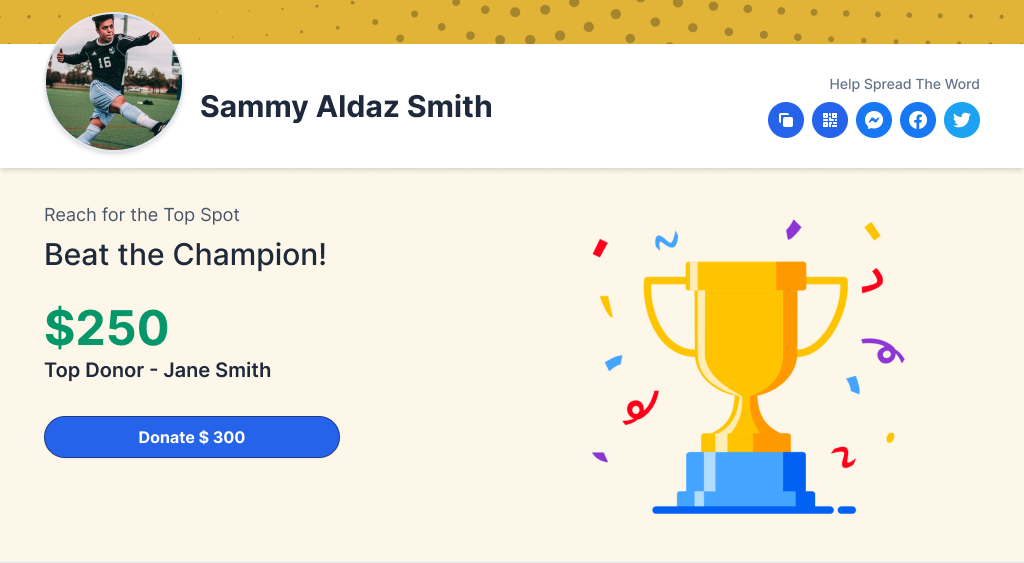
A winning feature, pulled once the people closest to the community pushed back
Every change shipped as its own A/B test through 2022, measured against years of benchmark data, so each result below is an isolated, proven effect, not a bundle.
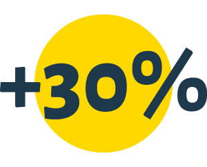
30% more donors reached checkout
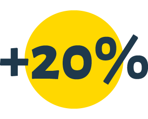
Checkout conversion improved by over 20%
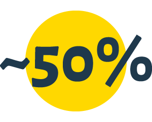
Time to complete checkout cut almost in half
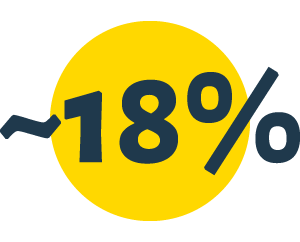
Average donation amount increased by approximately 18%, a meaningful shift after years of stagnation
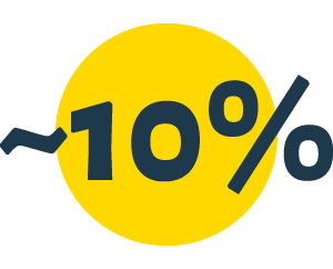
End-to-end completion improved by nearly 10%
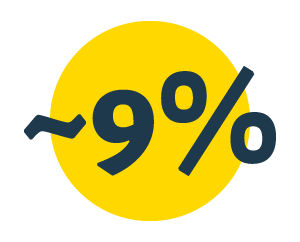
Average first donation increased by nearly 9%
Snap! didn't just reach the milestone that mattered most, its first million-dollar day. The redesigned experience helped turn that one-time peak into a repeatable outcome, and then doubled it.
The biggest gains here didn't come from making screens look better. They came from changing the order things happened in. Before redesigning a screen, it's worth asking whether it even belongs where it sits in the flow.
Team branding wasn't a flashy feature, but when an experience feels like it comes from someone you trust, people behave differently. A 20%-plus conversion lift came from a change that was really about belonging, not aesthetics.
A feature can win the test and still be wrong for the people using it. The data is necessary, but the judgment about whether to ship has to come from understanding the community you're designing for.