Conversion That Delivers
Increasing qualified leads by 360% at A Place for Mom
I joined A Place for Mom in 2020 as a Senior Product Designer, right after the company was acquired by a new investment group. APFM had built their brand through TV advertising and a call-center-first model—people saw Joan Lunden on TV and called the 800 number. But their users were changing. Adult children researching care options for aging parents were increasingly starting their journey online, and the company needed to evolve.
The directive from new leadership was clear: leverage the website to drive more leads. But there was tension between that goal and the reality on the ground. The site was generating leads, but the call center was drowning in unqualified inquiries—users who couldn't be served (Medicare restrictions) or weren't actually serious about moving forward.
This project spanned most of my time there and touched the core user journey: home page, destination (location) pages, search results, and community detail pages. It was ongoing work done in sprints, constantly iterating against organizational pressure and evolving business priorities.
On the surface, leadership wanted more leads flowing through the site. But when you looked at the data, the picture was more complicated:

Friction and roadblocks throughout the journey, designed to capture leads early rather than let users self-educate

Critical information for decision-making—pricing, reviews, location—was buried below the fold

Users dropping off before reaching community detail pages, where qualified leads naturally happened

Lots of leads, but many were unqualified—users who couldn't be served or weren't ready

Call center overwhelmed sorting through low-quality inquiries
The site was optimized for lead volume to show investors growth, not lead quality to actually serve the business or users. Marketing held more influence with leadership than product, and they favored aggressive capture tactics—lead forms gating information, search bars that were actually lead capture traps, friction at every turn.
The irony was that data from FullStory showed qualified leads came from users who made it to community detail pages. But we'd built so many walls getting there that most users never arrived. We were optimizing for the wrong metric.

High incoming traffic

Home Page Trap
Fake search bar that triggers lead form

High bounce rate
High unqualified lead rate
Few users find their local destination page
Destination Page Trap
Above-fold wizard obscures community listings below
High bounce rate
High unqualified lead rate
Escape hatch: Users scroll past the wizard

Community Detail Page Conversion
Natural conversion paths (pricing/availability)

Leads 85% more likely to qualify
High user intent and motivation
My approach was rooted in a simple idea:
This meant:
The challenge was that this approach would reduce overall lead volume in the short term, which made leadership nervous. They needed numbers for investors. The marketing team pushed back hard, arguing that removing gates would tank lead generation.
I had to prove that better-qualified leads from community detail pages would more than make up for losing window-shoppers upstream. The community detail page exemplified these problems and gave us the freedom to prove our approach:
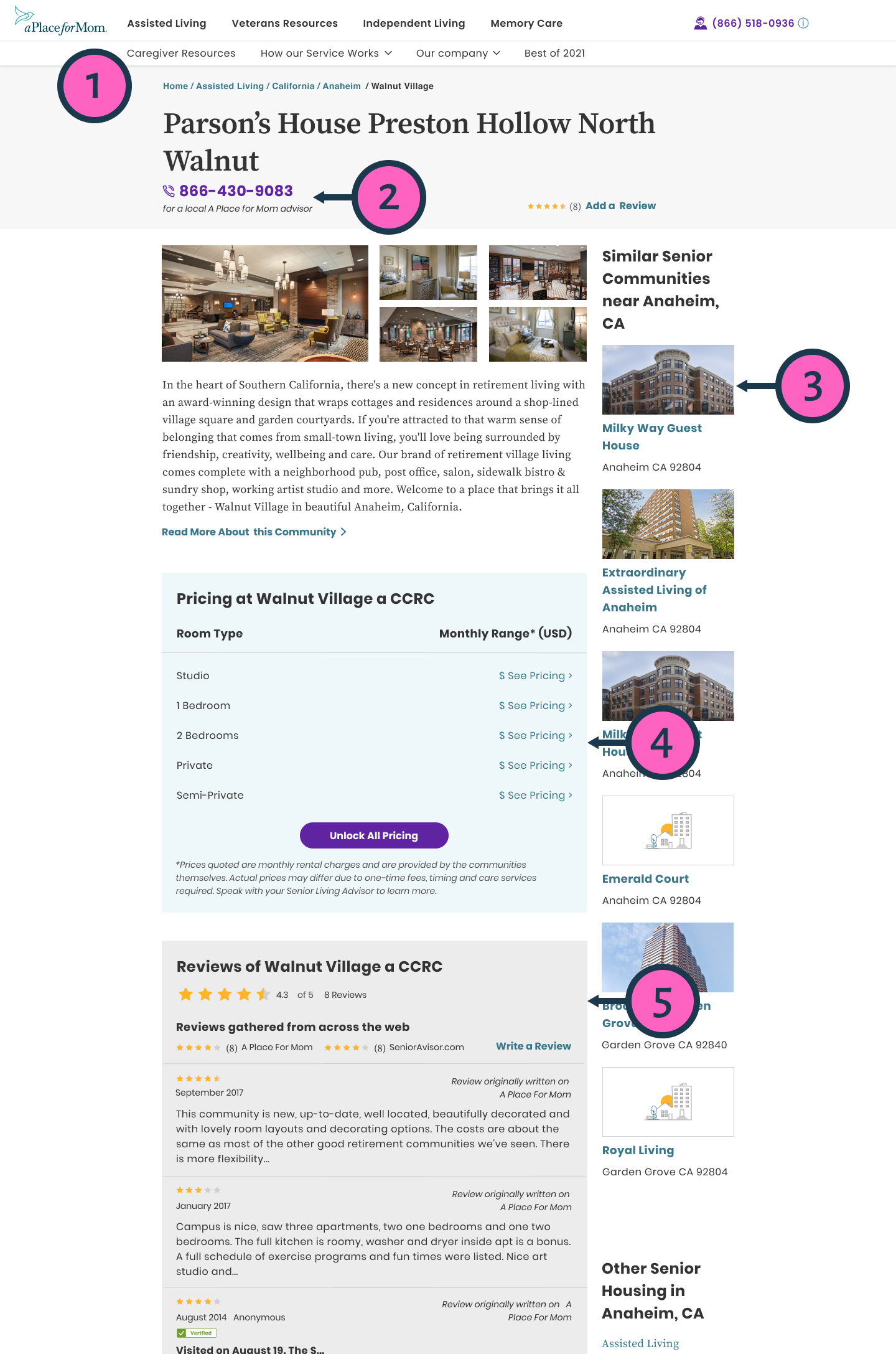
1. No Page Navigation
Long scroll with no indication of available information below
2. Missed Lead Capture
Only CTA above fold was a phone number—we couldn't capture lead data or control the conversation
3. Competing CTAs
Similar communities featured prominently, encouraging users to leave before engaging
4. Pricing Buried
Pricing—a primary conversion driver—hidden below fold and often buried under long descriptions
5. Reviews Lacked Functionality
Reviews present but not actionable—no filters, no aggregated ratings from our own survey data
I used several approaches to build buy-in:

We used FullStory to track user sessions and identify drop-off points. The patterns were clear—users would hit a lead gate, back out, try a different path, hit another gate, and bounce. We had traffic, but we were blocking our own funnel.

I looked at direct competitors and adjacent markets like Zillow and Airbnb. The pattern was consistent: transparency builds trust. Sites that surfaced pricing, reviews, and location information upfront generated better-qualified leads.

We ran A/B tests on individual changes to prove the concept incrementally. When we reduced friction on test variants, scroll depth increased and users engaged more deeply with content. This gave us ammunition to push for broader changes.
The key was framing this as a business win, not just a user experience improvement. If we could get more users to community detail pages, we'd generate better leads even if overall volume dipped slightly.
This project spanned multiple PM changes and a shift in my direct management. Each PM came in with aggressive quarterly targets, and there was constant pressure to add more lead capture points—more forms, more friction, more gates.
Some battles I won. Some I lost. The marketing team's influence meant some decisions weren't driven by what data showed worked best, but by what felt safer to leadership. I learned to pick my battles and focus on protecting the core improvements that mattered most.
Three key design decisions shaped the redesigned experience:
The homepage generated the highest lead volume, but most weren't qualified. The hero search bar looked like it would search, but actually triggered a lead form—users felt tricked and bounced. We explored several options, knowing that destination pages also had their own wizard trap.
Appeared to search, actually triggered lead form
Option 1

Replace with more obvious lead form
Option 2

Actually perform a search and show communities
Option 3

Send user to closest destination page
Enter Location


Destination Page

Lead Wizard “Trap” Maintained Volume

Community Listings Below Fold
We chose destination pages as a compromise. True search (Option 2) generated better qualified leads but tanked overall volume too much for leadership to accept.
Destination pages maintained volume while letting serious users scroll past the wizard to reach community listings. The result: similar overall lead numbers with a meaningful increase in qualified leads.
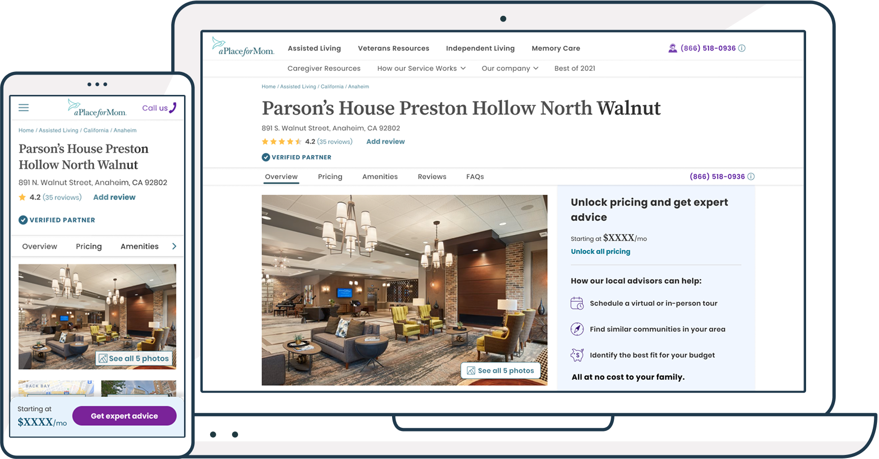
The original page prioritized a photo gallery and "similar communities" suggestions right at the top—optimized for SEO but not for users. Pricing was buried three or four scrolls down. Reviews were at the bottom. Users told us through research that pricing, reviews, and location were their top decision factors, in that order.
We restructured accordingly: condensed six gallery images into one hero image with a view-more option, brought pricing visibility to the top, surfaced reviews and ratings prominently, and added one-click map access. "Similar communities" moved to the bottom where they belonged—helpful for users who wanted alternatives, but not blocking critical information. The result: scroll depth increased to 65-75% (users were engaging with content instead of bouncing), and time on page improved significantly.
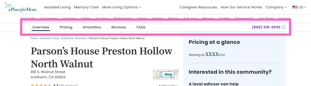
Jump navigation lets users scan available information and go directly to priority sections
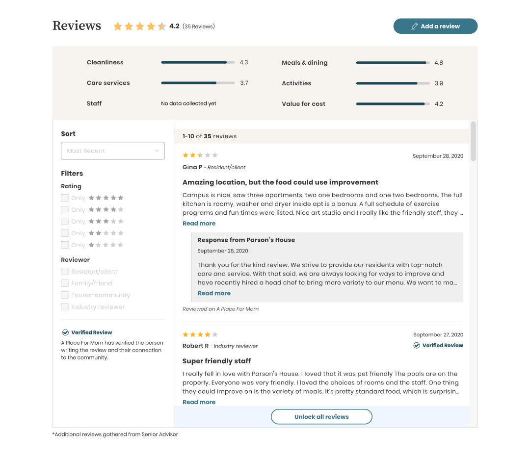
Added filtering and surfaced aggregated ratings from our own survey data - making a top-3 decision factor more actionable
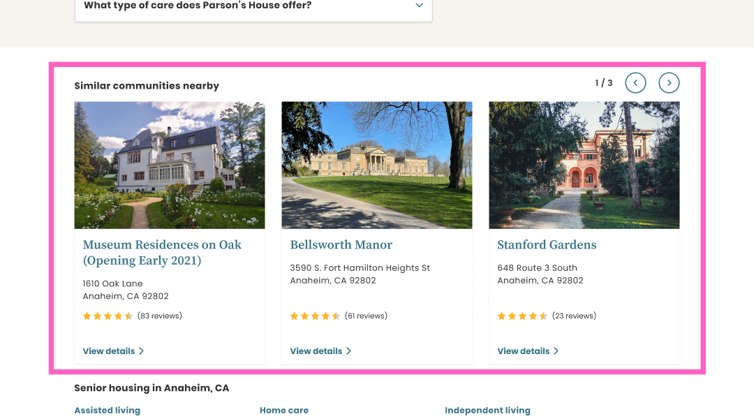
Reorganized content hierarchy based on user priorities - for example, moving similar communities to the end so they appear naturally after users have reviewed all community details
With users now engaging deeper into the page, we needed conversion opportunities that felt contextual rather than forced. We introduced multiple conversion points throughout the experience - gated pricing, review access, tour scheduling prompts, room availability, and expert consultation offers.
The sticky CTA emerged as the dominant conversion driver, generating approximately 85% of community detail page leads. Its persistent visibility combined with clear value proposition (unlock pricing + expert help) made it the natural path for users ready to take action.

The work paid off:
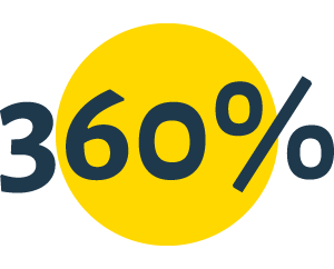
360% increase in leads from community detail pages
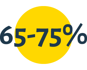
65-75% scroll depth - users engaging deeply with content, not bouncing

Improved lead quality - better ratio of qualified to unqualified inquiries

Improved page performance - pages became more content-rich and user-focused
The business case proved out: letting users self-educate and move naturally through the funnel generated better outcomes than trying to capture everyone immediately.
This project taught me that organizational dynamics matter as much as design decisions. I could show competitive analysis and user flows all day, but if marketing had the CEO's ear, it didn't always matter. Learning to build alliances, frame changes in business terms, and pick my battles strategically was as important as the design work itself.
If I were starting over, I'd push harder earlier to align stakeholders around lead quality over lead volume, and I'd sequence the work differently—starting with the community detail page restructuring (where we had more freedom) to build credibility before tackling the politically sensitive homepage.
But ultimately, I'm proud of what we shipped. Despite the organizational challenges, we proved that user-centered design and business goals aren't in tension when you understand both deeply. Better-qualified leads benefited everyone—users got better service, sales spent time on real prospects, and the business got sustainable growth.