An information architecture redesign for NYC & Company's website, NYCgo.com; the official guide to New York City.
Information Architecture, User Research & Testing
Team of 4 UX Designs
Client Point of Contact, UX Designer, UX Researcher, UI Designer
Sketch, Invision, Photoshop, Illustrator, Keynote, Trello, UserTesting.com, OptimalWorkshop.com
Card Sorting, Screener Surveys, User Interviews, Affinity Mapping, Archetypes, Journey Mapping, Heuristics Evaluation, Behavioral Matrix, Design Studio, Sketching, Wireframes, Iterative Testing, Prototyping, Usability Testing
New York, New York, the city that never sleeps; with over 8 million people who call NYC home and an additional 62.8 million visitors annually, it can be a crowded, fast-paced, and overwhelming city. How does one possibly keep track of all the goings-on? That's where NYC & Company comes in. As the official guide to NYC, they are the go-to on everything the Big Apple has to offer.
Since their award-winning 2016 redesign, their site has become overwhelmed with information, and they felt this might be impacting their users and leading to increased bounce across their website. They reached out to my team to analyze, user-test, and make suggestions for improvement to their current information architecture.
We first sat down with NYC & Company to learn more about their organization and the users they serve. They had three main groups of people coming to their site for information:


Also, based on their site’s traffic, most users were using a mobile device to access NYCgo. Due to this factor, we felt it would be best to take a mobile-first approach to this project.

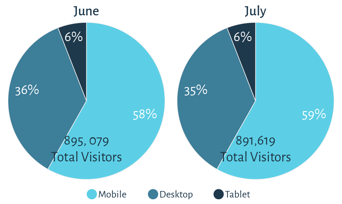
Month-over-month, the majority of users accessed NYCgo via their mobile devices.
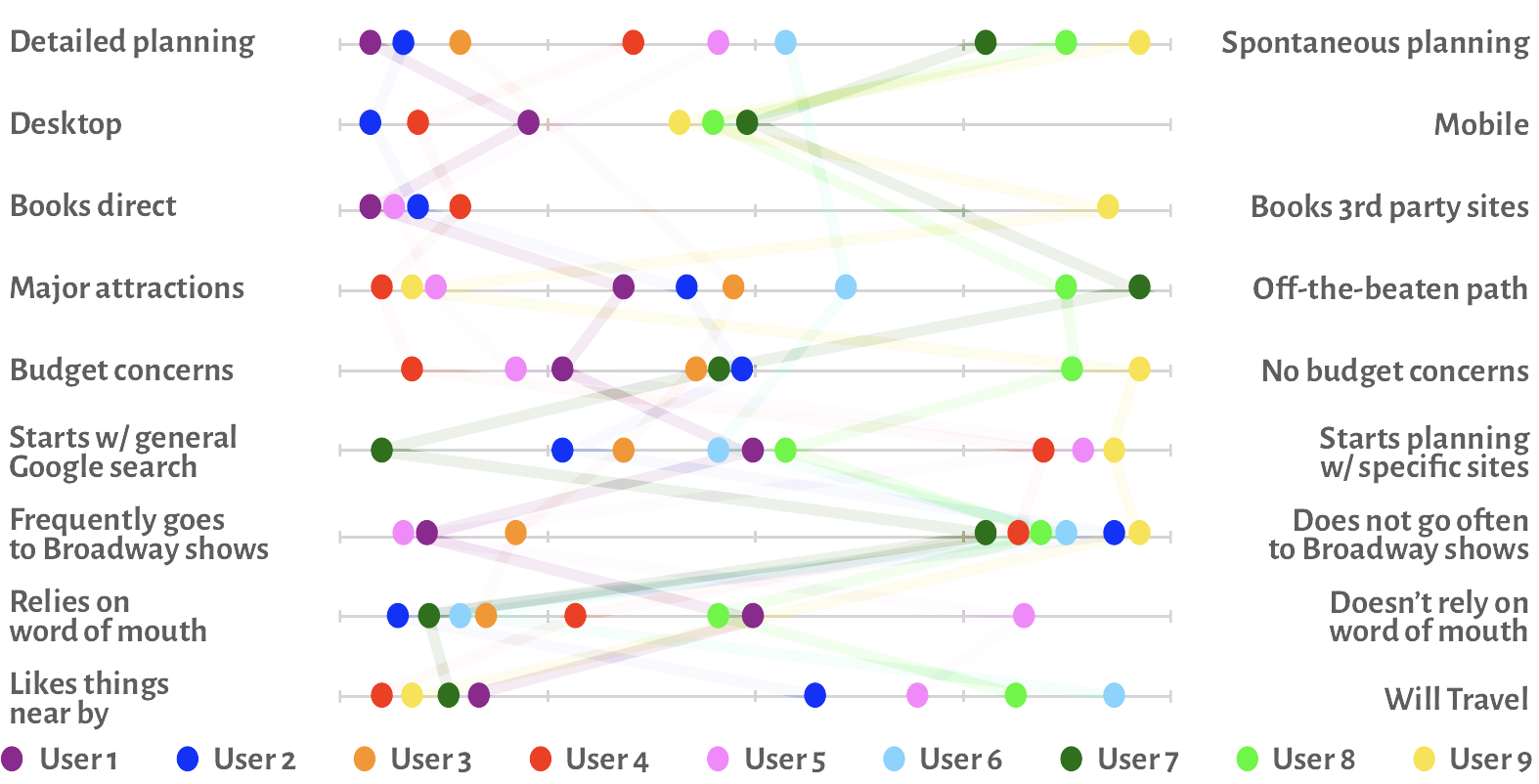
Now that we had some initial information, it was time for us to speak directly with users and see if NYCgo does indeed have three unique visitor types or were there commonalities that users shared. We interviewed nine users making sure to have diverse representation, interviewing three locals, three domestic travels, and three international travelers. Some insights started to emerge:

“I need to feel secure when booking and planning events, so I book direct.”

“I love to explore hip new restaurants and cuisines when in New York.”

“I use third party sites to bundle booking things like flights and hotels.”
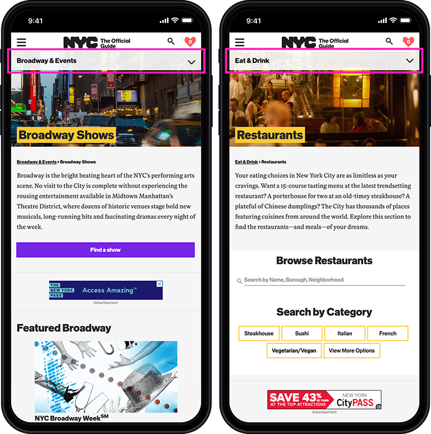
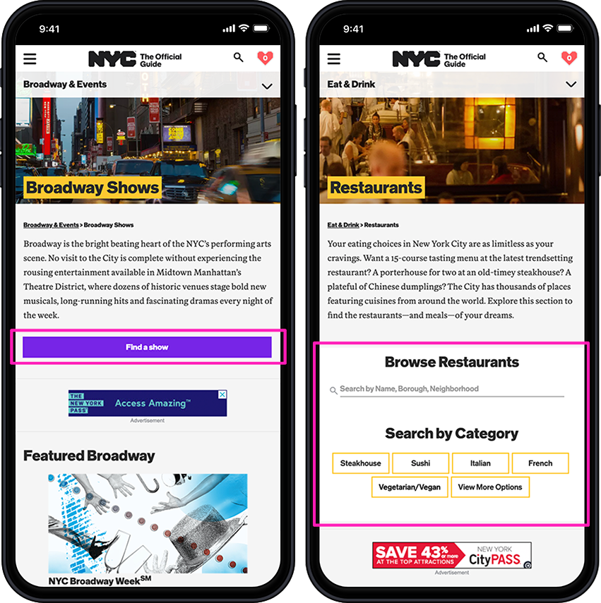
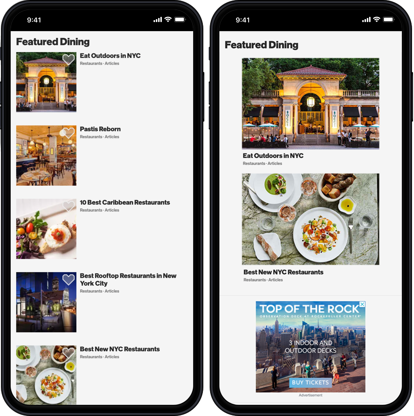
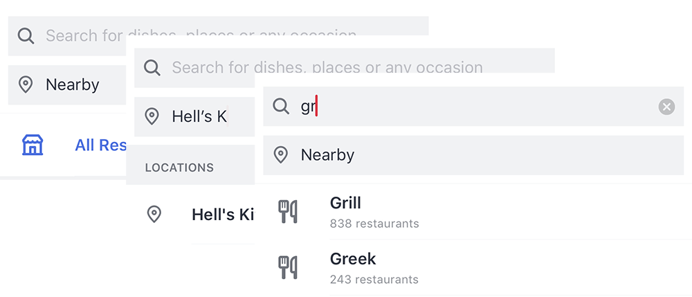
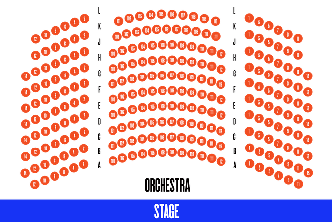
It was also essential for us to see users interacting with NYCgo to get a first-hand sense of any areas of delight or frustration they were experiencing. We performed 2 test scenarios as a benchmark. Firstly, to find tickets to Wicked on a specific date. Broadway tickets are the only vertical sale on NYCgo, so sales directly benefit them. Secondly, to find a Greek restaurant in Hell's Kitchen. 90% of users surveyed said restaurants were the more important leisure activity to them.

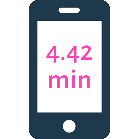
Average Time on Task
Mobile
VS.
Desktop

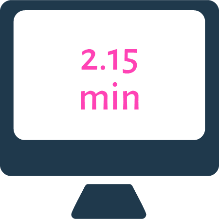
On average, users spent twice as long to complete tasks on mobile. We knew this was an issue as most mobile users are on the go and don't have the extra time to spend searching a site. Though, users overall experienced a great deal of frustration across all devices:
“I’m just so frustrated with the navigation on this site.”We looked at ten other US and World city sites that offered like information to NYCgo. Looking at their navigational structure would give us an idea of any design patterns that NYCgo was missing out on:
For NYC & Company, our team would have to take a different approach to analyze the data from our user interviews. Personas would not be appropriate as NYC & Company is very concerned with being as diverse as possible since they have such a large user base to serve. Our team decided it was best to use behavioral archetypes instead.

We first affinity mapped to find common themes between users. From those insights, we were able to plot key areas on a behavioral matrix to help us better understand our varied user groups. Two archetypes began to emerge:


With these behavioral archetypes in mind, it was now time to begin analyzing the information architecture of the NYCgo. Keeping in mind what our archetypes were looking to achieve on the site would allow us to focus our efforts.
We evaluated NYCgo using the Abby Heuristics Method that looks at ten key areas; Delightful, Valuable, Findable, Credible, Learnable, Controllable, Communicable, Accessible, Useful, Clear, and Finable. By assessing these areas, we would not only get a sense of any IA, hierarchy, or UI issues, but we could potentially find other areas of concern.
We found that overall, NYCgo had Major to Medium issues in 7 out of 10 categories.

We first performed an open card sort using the existing navigation of NYCgo’s site. What was found was that users typically placed items into four categories, very similar to the current primary navigation of the website.
From our previous user testing and heuristics evaluation, we knew that this was not necessarily the best strategy for the site. Users would benefit from some areas of interest being highlighted, like restaurants and Broadway information, in the primary navigation, and others being deemphasized, like hotel information.
As we were tasked by NYC & Company to rework their information architecture, we would be focusing on two main areas, site navigation & hierarchy of information on the page. We would start with the navigational structure as it is the backbone of a website. To have a well-rounded information architecture, we would have to consider ontology, taxonomy, and choreography.
From our open card sort, we saw that users had mostly placed items in a similar structure to what NYCgo currently uses. But, from user interviews and competitive analysis, we also noticed that what is relevant to users is being buried deep in the site's navigation. We also noted that some labels in the navigation were unclear or confusing to users. We felt that it would be best to increase the breadth of the primary navigation while decreasing the depth of layers users needed to sift through.
Informed By: User Interviews and Open Card Sort
Part of NYCgo’s current navigation. In testing, users identified “The City” as having to do with information about NYC, its neighborhoods, services, and history.
Informed By: Competitive Analysis, Open Card Sort, Heuristics
7/10 competitors had a “Things To Do” section, which was a strong indication of a design pattern for this industry. Most city information websites had attractions, museums, and other events under this label. “Things To Do” largely replaces “Explore” in their current navigation as users found this label unclear.
Informed By: Competitive Analysis, User Interviews, Business Goals
During the competitive analysis, cities' featured unique attractions in their primary navigation. Most users also noted that catching a show in NYC was a high priority for them. Broadway tickets, the only vertical sale on NYCgo, have been in decline since "Broadway" removed from the navigation post the 2016 update.
Informed By: Competitive Analysis, User Interviews
90% of users surveyed stated that restuarants were a primary concern while in NYC. On competitors' websites, dining was also highly visible in their top-level navigation.
Informed By: User Interviews, Open Card Sort, Business Goals
Generally, our archetypes either booked hotels directly or bundled their flight and hotel on a 3rd party site. It is important to NYCgo's mission to help promote staying in less highlighted areas of the city. Due to these factors, we decided to keep hotels on the primary navigation but combine it with other information people visiting NYC might need.
Now that we had a starting point for our primary navigation based on our research, it was time to check back in with users. We would perform a closed card sort to test the onology of our primary navigation, as well as the taxonomy of its relationship to secondary navigation labels.

Users felt unsure where to place Off-Broadway and cultural events. Expanding "Broadway" to "Broadway and Events" would help encompass more topics.

Users were very split on where to place this label. Most users felt each category could feature a New and Trending section.

For users, there was a lot of cross-over between where labels could live. The site should follow more of a co-existing hierarchy pattern to fit different mental models.
With user insights from the closed card sort, the time had come for us to formalize a new navigational flow for NYCgo. All of our previous data would inform and validate our new site map.


The navigation now expanded for a broader primary level and less deep secondary and tertiary levels. Also, we eliminated all quaternary navigation levels. We hoped that users would now be able to find the information they needed in fewer clicks. We would test our new navigation after we also made a few changes to the information hierarchy.
The last important part of any information architecture redesign is focusing on the choreography, or flow, of information to the user. As a redesign was not really within the scope of this project, we decided to focus on meaningful areas of improvement to the hierarchy of information and functions of the website, as informed by our research. We would again focus on our two tasks of finding a restaurant and booking a Broadway show.

An additional navigation method would help users switch between secondary navigation elements within their parent. As informed by user testing and heuristics, desktop users can switch between secondary navigation elements with ease, but this is not the case on mobile. Users have to start each new navigational request, in essence, from "home."

Previously the ability to initiate a search of Broadway shows or restaurants was buried on the bottom of both pages. We moved this ability to the top of the page. User research revealed this was the function within these pages that were the most important to users. Also, the restaurant search bar, not previously available on mobile, had aided desktop users in quickly finding what they needed.

Left: Current NYCgo Site. Right: New Proposed Layout
The initial reaction to the Broadway and restaurant pages on NYCgo by users was of being overwhelmed with information. The "featured" section, which is the first to greet users on these pages, originally contained 48 items broken up into 8 sets of 6. We limited this to just 2-3 items and enlarged their photos to give them importance and clarity on the page. Further down the page, we listed the remainder of these items under a new "Spotlight" section.

Within the Broadway section of NYCgo, users had difficulty accessing the filtering tools necessary for them to narrow down their show selection. We made these filtering tools more promonant on the page. Additionally, no sorting feature existed when selecting tickets. Lack of this feature led to adverse user reactions as users had to sift through a jumble of available tickets.
Once again, it was time to check in with our users. This time though to see if our changes imformed by our research and insights had improved the users experience with NYCgo. We would test this by measuring the amount of clicks it takes users to now complete our two tasks, finding a Greek restaurant in Hell's Kitchen and finding tickets for Wicked on a specific date.

13
10
7
5
Averaging the amount of clicks users had to take to complete each task on mobile, we were able to reduce clicks in half. Users also reported having a better overall experience.
Through we were at the end of our consultancy with NYCgo was over, it doesn’t mean the work stops. Further exploration is needed to ensure their continuing success:

Open Table's location and search feature.

User's expected to see a seating chart to know where they would be sitting.
It was a rewarding experience to work with a client on the level of NYC & Company. Their site plays a vital role in the fabric of New York City. As someone who has called this concrete jungle home for over ten years, this project brought an intense level of pride in getting to leave my mark on this impressive city.
I also had the pleasure of working with some awe-inspiring and brilliant people on this project. When a team works in unison and can complement each other's backgrounds and skillsets, it really comes through in the work.