Onboarding on Their Terms
The middle of the funnel nobody had designed for
Snap! Mobile's fundraisers run on one person: the participant. A coach sets up the campaign, but it's the teenager on the team who invites their network, and if they don't, no donors ever show up. Everything downstream depends on that one teenager doing the work.
That engine was running on a portal built in 2014, by the sales team, for the sales process. It asked a teenager to enter up to 20 emails, 20 phone numbers, pick gift sizes, and come back multiple times, and it gave them no reason to care. Only about a third ever finished.
Leadership framed it as an engagement problem: make it appealing enough that teens complete it. That was real, but it wasn't the whole problem. The deeper issue was that the product had misread who was actually doing the work.
That reframe is what turned a teen-onboarding project into something bigger, a 157% lift in completion, and the foundation for a market the company had been chasing for years.
As the sole designer, I owned research and design for phase two of migrating Snap!'s flagship product to a new stack, the middle of the funnel, where participants invite the donors everything else depends on. Three realities shaped the work before I drew a single screen:

My users were teenagers who didn't want to be there, doing what felt like homework for a cause they cared about but an experience they didn't.
Every research session required a guardian present, a detail that shaped what I heard and turned out to matter more than I expected.
They lived on their phones. A portal built desktop-first in 2014 was competing for attention with TikTok and Snapchat.
The portal wasn't just dated. It was built by the sales team, for the sales process: every screen optimized for what the business needed to collect, up to 20 emails, 20 phone numbers, gift sizes, return visits. None of it for the teenager being asked to do the collecting.
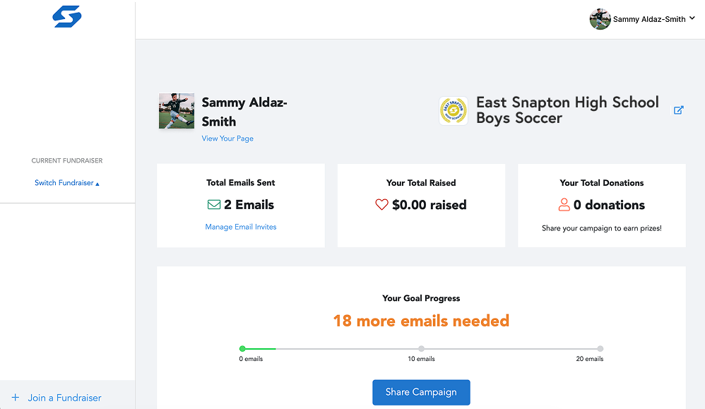
The 2014 portal, built for the sales process, not the teenager using it
The result defined the project: only about a third of participants finished onboarding. On a team of 20, roughly 13 kids never made it through, and every one who dropped meant donors who'd never be invited.
But the deeper problem wasn't friction. It was a wrong assumption baked into the flow. The product treated the teenager as a solo actor who had 40 adult contacts and would enter them alone. Teenagers don't have 40 adults' contact information. Those lists came from parents, every time. Fixing the friction would lift completion. Correcting that assumption is what turned an onboarding redesign into something larger.
Snap!'s design system was built for SaaS dashboards: clean, professional, neutral. For teenagers, neutral means forgettable. I pushed for a mobile-first, illustrative, colorful direction closer to the apps these kids actually live in, TikTok, Snapchat, Duolingo. Something with energy.
Leadership disagreed. They thought it looked too young, that teens would prefer something more polished and adult. I held the opposite view: this is exactly what the apps built for teens do, and these kids aren't as grown as the adult framing assumed. I was staking my credibility on a research-backed hunch while being told I was wrong.
Rather than keep arguing it in the abstract, I put the new designs in front of real teenagers in our research sessions. The kids engaged immediately, explored, reacted. Their response settled it where my arguments couldn't.
The new onboarding flow, returning participants see their info pre-filled, cutting friction further
The research kept pointing at one thing. Every session needed a parent in the room, and every contact list a teenager produced had come from a parent. The product was asking kids for 40 adult contacts they simply didn't have. The real source of those contacts, the person who actually made a fundraiser work, was standing just off-screen the whole time.
The old system treated the guardian as just another donor: they got an invite to give money, but had no role in the fundraising itself. That was the miss. For most participants, fundraising was a family activity the product insisted on treating as a solo one.
So I moved the guardian invite to the front of the flow, before launch, and gave parents a real role: helping their child build contact lists and manage the fundraiser. Not a donor to be solicited later, a partner from the start.
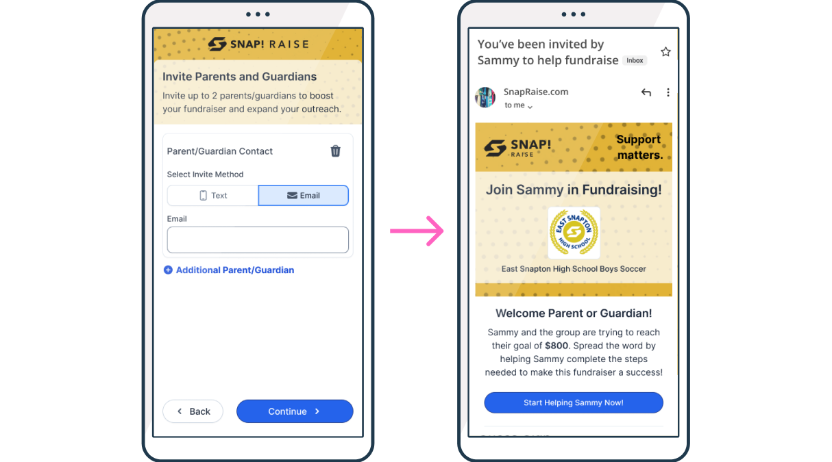
Participants invite their parent during onboarding, the guardian joins to help fundraise, not just to donate
The data proved it out: participants who brought a guardian in raised three times as much as those who didn't. The decision that fixed onboarding's biggest failure point was the same one that unlocked what came next.
The old flow front-loaded the work and buried the payoff. It asked for contacts and gift sizes before a teenager ever saw what any of it was for. So I rebuilt the order around one principle: give them a reason to care before asking them for anything valuable.
Old Flow
Profile

Gift Shop Size Selection
Guardian Invite
Invited as a donor only
Email Entry
TEXTING ONLY AFTER LAUNCH, RARELY USED
Rewards
MOTIVATION BURIED AT THE END
Dashboard
View-only, nothing to return for
New Flow
Profile
Guardian Invite
Invited to help fundraise
PARENT AS PARTNER, FROM THE START
Gift Shop Size Selection
Explanation Screen
Here's how your fundraiser works
Rewards
MOTIVATION FIRST, BEFORE THE ASK
Email Entry
Text Entry
Ability to pre-load before launch
Task Manager
Track donations, add contacts, unlock rewards
A HUB THEY RETURN TO
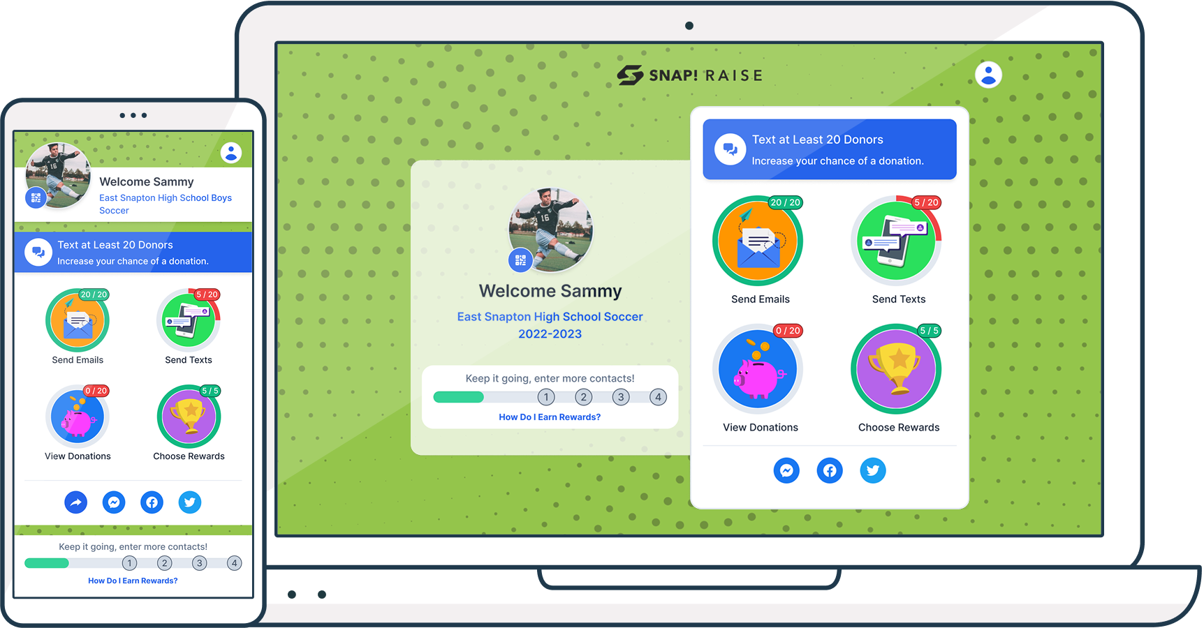
The old dashboard was a static, view-only page built for the sales process. I replaced it with an interactive task manager, the home base a returning participant lands on, designed to pull them back in and keep them moving.
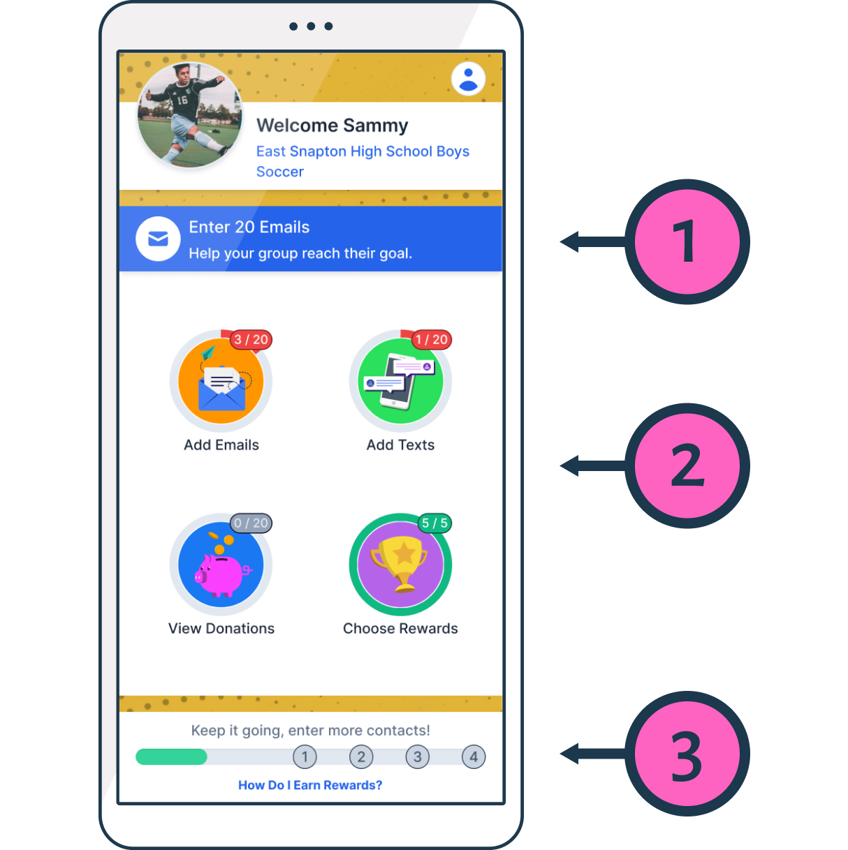
1. Always a Clear Next Step
Contextual prompts point to the next task, starting with the highest-value one, so kids never wonder what to do.
2. Four Focused Actions, Not a Dashboard
Large, illustrated buttons narrow the whole experience to the four things that matter, built to feel like an app, not office software.
3. Progress Toward the Reward
A visible track ties every action to what they're earning, turning tasks into motivation.
Kids were shown youth and adult sizes at once and often picked wrong, and wrong-size items shipped with no exchange. I defaulted each school to its likely size set with a toggle for the other, and brought guardians in to review before anything locked.
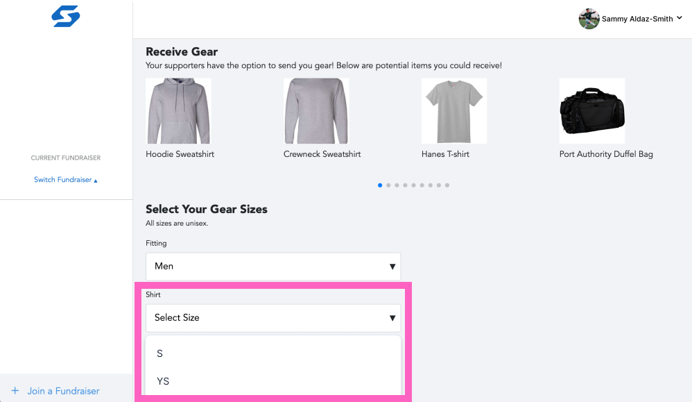
Before: every size shown at once, kids saw "Youth Small" and "Small" and didn't know which they were
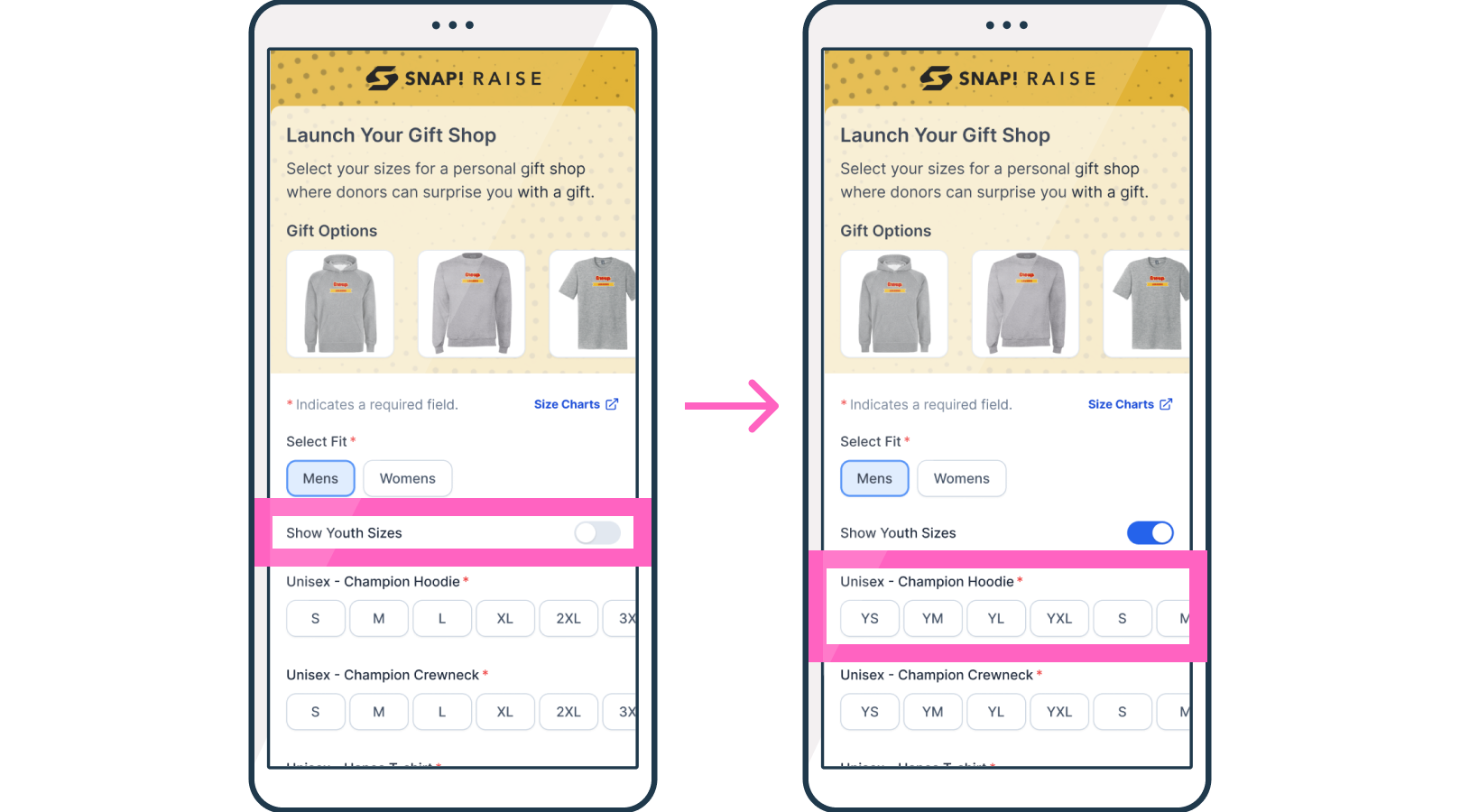
After: sizes default to their grade/school level, with additional sizes a toggle away if needed
Fundraising isn't one-and-done, kids run campaigns season after season. So the experience remembers them. Everything they set up once carries into the next fundraiser, so a returning participant starts ahead instead of from zero.
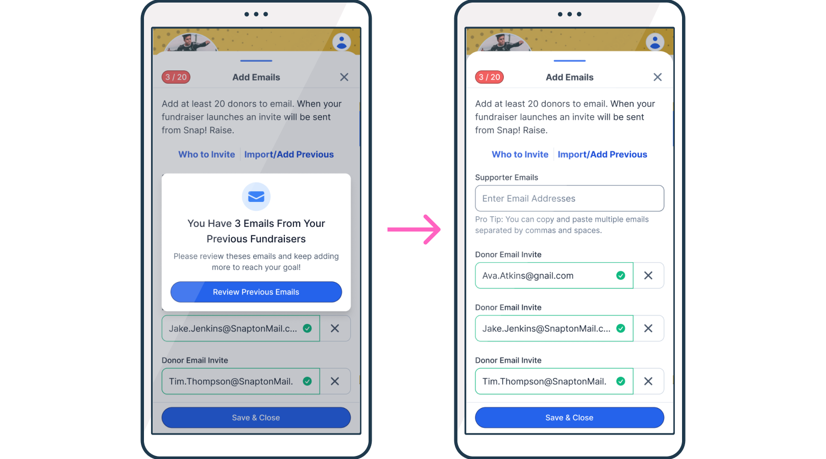
Returning participants start ahead, with everything they set up last fundraiser carried forward
Measured over three months against the old experience, the redesign moved every number that mattered.
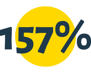
Onboarding completion increased by 157% — nearly 9 in 10 participants now finishing
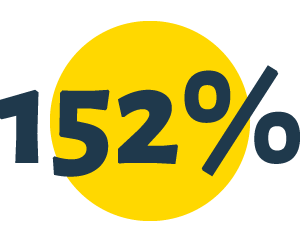
Task completion increased by 152% — kids were actually entering contacts
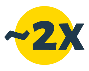
Guardian invite rate nearly doubled compared to the previous system
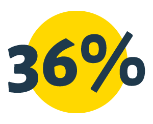
Onboarding time decreased by 36%
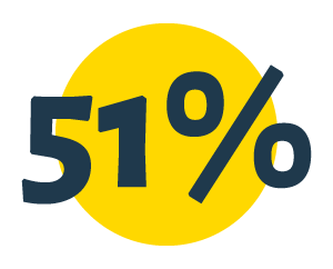
Over half of participants submitted text invites within the first week of launch
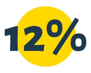
As a direct result of this redesign, a school-wide campaign raised 12% more than the prior year — their highest total in over six years
The guardian system was built to help teenagers. It ended up doing something much bigger.
Because parents could now enter the experience and act on a participant's behalf, we'd quietly built the one thing the platform had always lacked: a way for an adult to run a fundraiser for a child who couldn't run it themselves.
That mattered far beyond the original project. Snap! could only support younger-grade fundraisers through heavy, custom dev work for each one, because younger kids can't manage their own campaigns and the platform had no built-in way for a parent to do it for them. The guardian infrastructure we built for teenagers was reworked to make guardian-led fundraisers work without that custom rework.
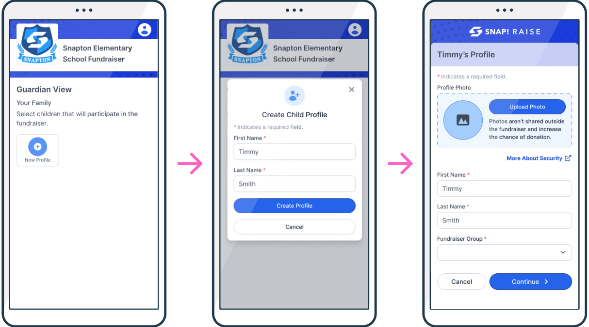
Guardian-led fundraising, parents can now create and manage a campaign for younger participants
A feature meant to get a 15-year-old's parent to help became the foundation for serving younger age groups at scale, without the custom build each one used to require.
My other Snap! work was for donors who'd already decided to give. Here, the participant didn't want to be there. Removing friction isn't enough when the default state is disengagement, you have to build pull, a reason to care before the ask.
The visual-direction fight proved a broader rule: real users in the room change minds that arguments can't. Leadership didn't move when I made the case. They moved when teenagers reacted to the work.
I wanted participants to land on the task manager and explore freely, guided by cues and nudges, not pushed through a linear tunnel. What shipped was a linear flow ending at the task manager. What I wanted was for the task manager to be the experience. Sales killed it before we could test it. They may have been right. But teenagers don't do what they're told and will happily explore something that feels like discovery, and I never got to find out. That's the one that stays with me.