Complexity, Made Completable
The top of the funnel sales couldn't stop running
Every Snap! Mobile fundraiser begins with a Group Leader, a coach or teacher, setting it up. On paper it was their job. In practice, sales did it for them, by hand, one fundraiser at a time. That was backwards. Reps should have been signing new schools and orgs, not filling out forms, and every form they touched was a chance to get a detail wrong. When they did, groups felt it: payouts came late or wrong, gift shop merch shipped in the wrong sizes to kids, and fundraisers launched behind schedule, right when a group needed the money.
Part of why sales owned it: the setup barely invited anyone else in. Nothing had defaults, so a half-finished setup didn't sit and wait. Missing fields broke the end experience and locked the GL out of their own fundraiser. Handing it to sales was easier than fighting it.
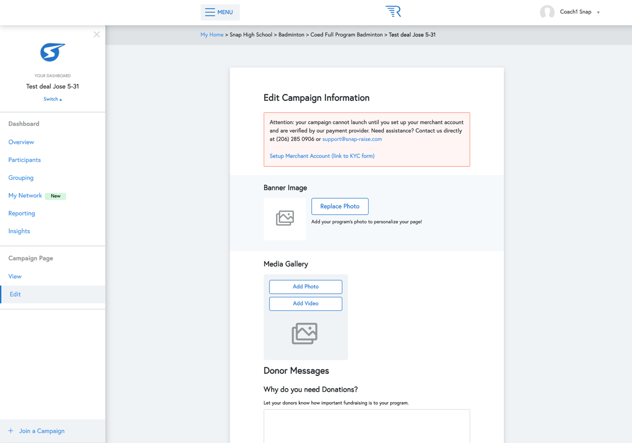
The old setup hid under Edit, scattered down the page, with the one launch-blocking step buried in a warning that linked out to a separate form.
The setup also carried the platform's highest-stakes step. The KYB and KYC required before any money moves must be completed by the person taking financial responsibility for the funds. Any process that relied on someone else to complete it created compliance and trust risk the redesign had to close.
Three realities set the boundaries before I drew anything. None of them were negotiable, and each one ruled out an easy version of the solution.

No test-and-learn lever. Real money and real compliance meant I couldn't split-test my way to confidence. I built detailed prototypes and tested them with real GLs.

Users pressed for time. Coaches and teachers, between classes and practices. Anything I designed had to survive being done in pieces, put down, and resumed.

One designer, two teams. Verification spun off as its own product with PMs and engineers but no designer. That was me, holding one standard across both.
The first instinct was the obvious one: take what existed and make it guided. Give GLs a clear path through setup instead of a buried Edit page. That became the Launch Center, setup broken into steps and wrapped in a rocket-ship motif that carried the metaphor of getting a fundraiser off the ground. Everyone who saw it liked it.
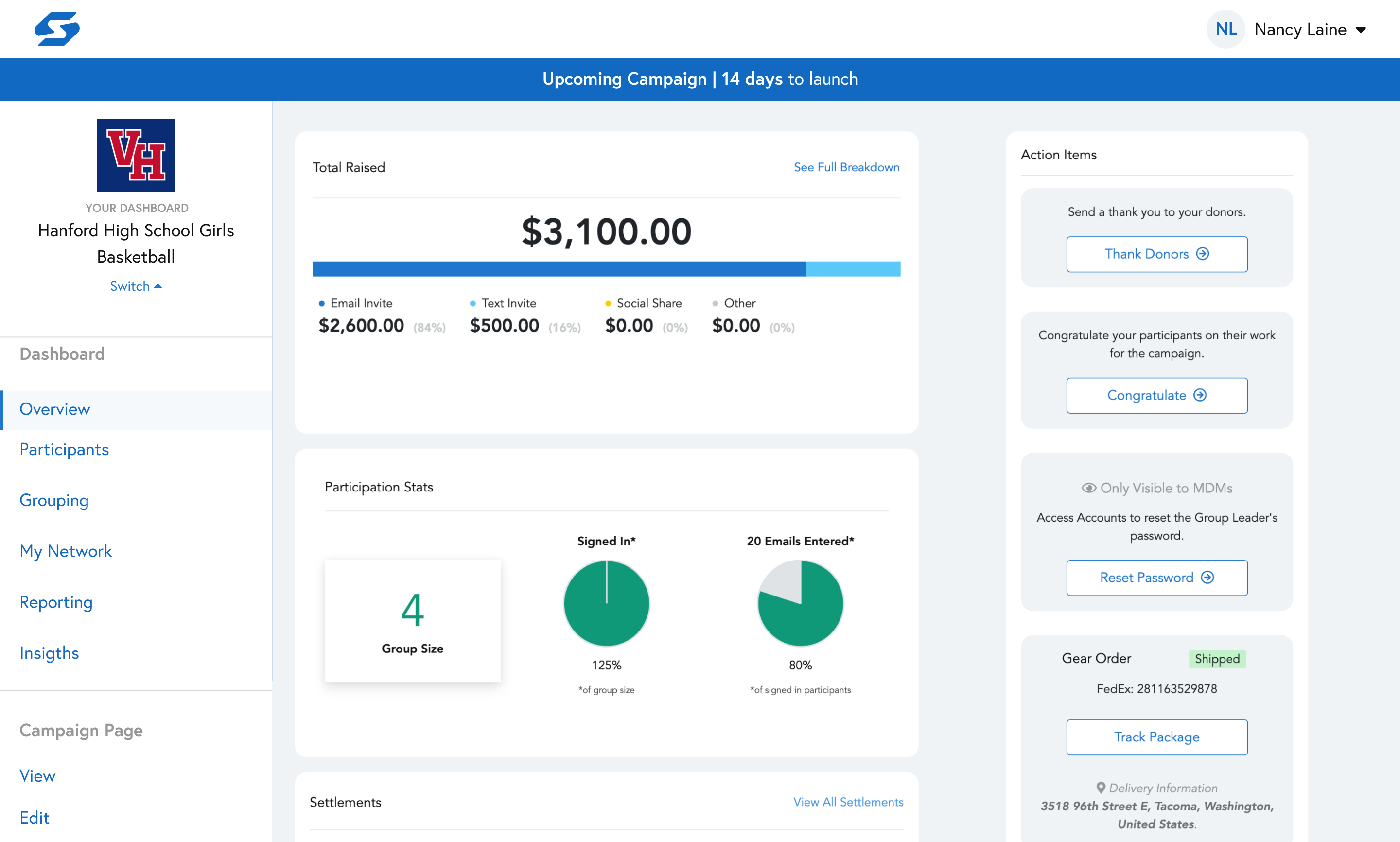
Before: The old dashboard, same tasks with no path through them.
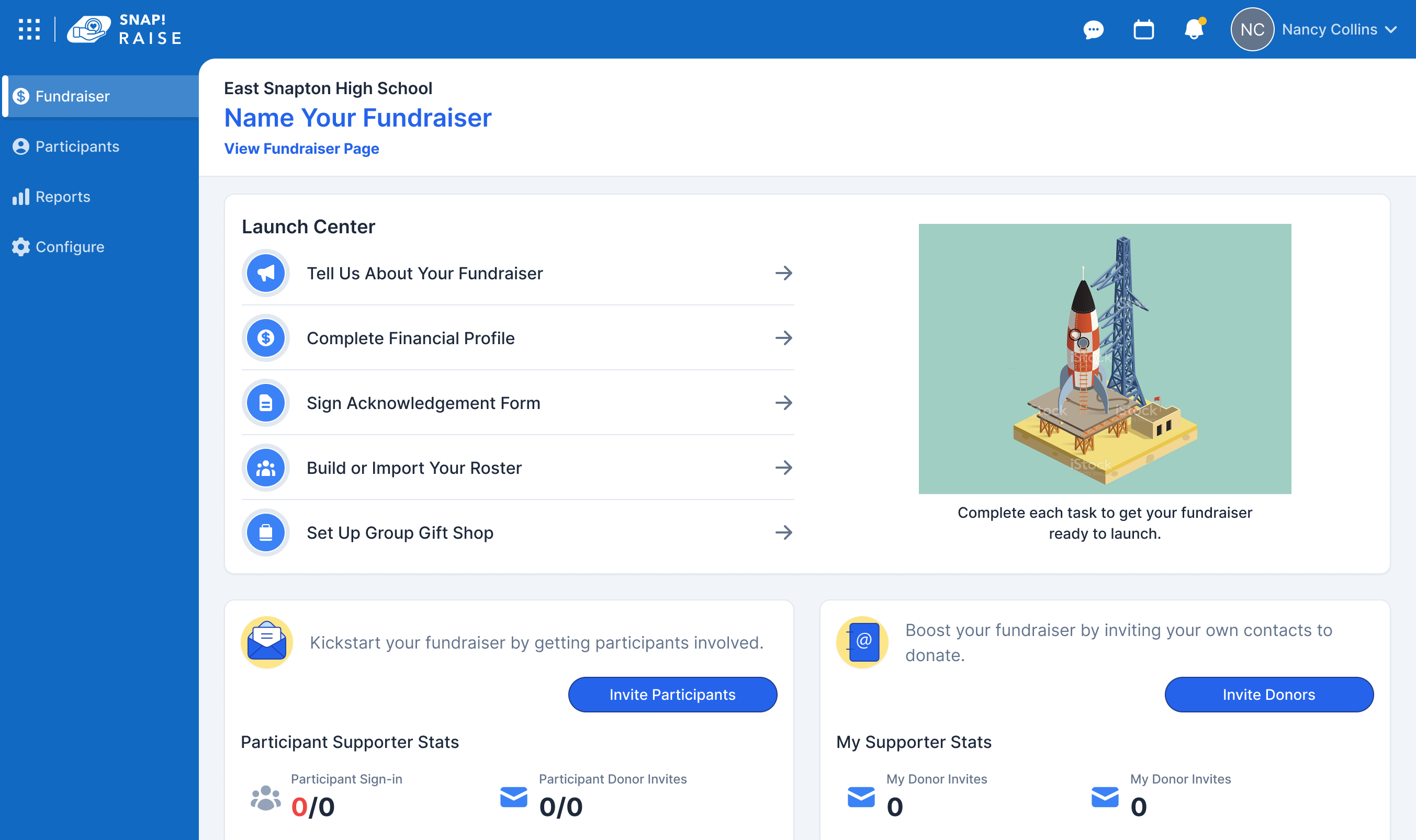
After: The Launch Center: guided steps, rocket-ship motif, dead on arrival with leadership.
The rocket ship did not survive executive review. It charmed everyone lower down but did not land with leadership, so it came off. I had argued to keep it, and tried other themes to save it, but we ultimately decided to streamline the approach.
Sharper feedback came from sales in that same stretch: this guided the setup, but setup was never what made a fundraiser succeed. We had made the old work clearer without touching the thing that actually mattered. That reframe sent us back, and it became the Success Plan.
Sales had named the problem, so I went back to them for the answer. What actually makes a fundraiser succeed? Three things, it turned out, and setup was only the first. A fundraiser worked when it got fully set up, when participants got onboarded, and when those participants loaded their contacts. The elements existed in the product already. Nothing guided a GL toward them, and nothing told them these were the moves that mattered.
The Success Plan made those three the spine of the experience. Setup stayed as the Launch Center. Onboarding broke down into signing participants up and getting a profile photo on each, the small thing that made a campaign feel real enough to give to. Preloading broke down further still, into a target of twenty emails and twenty texts per participant, the contact base every fundraiser lived or died on.
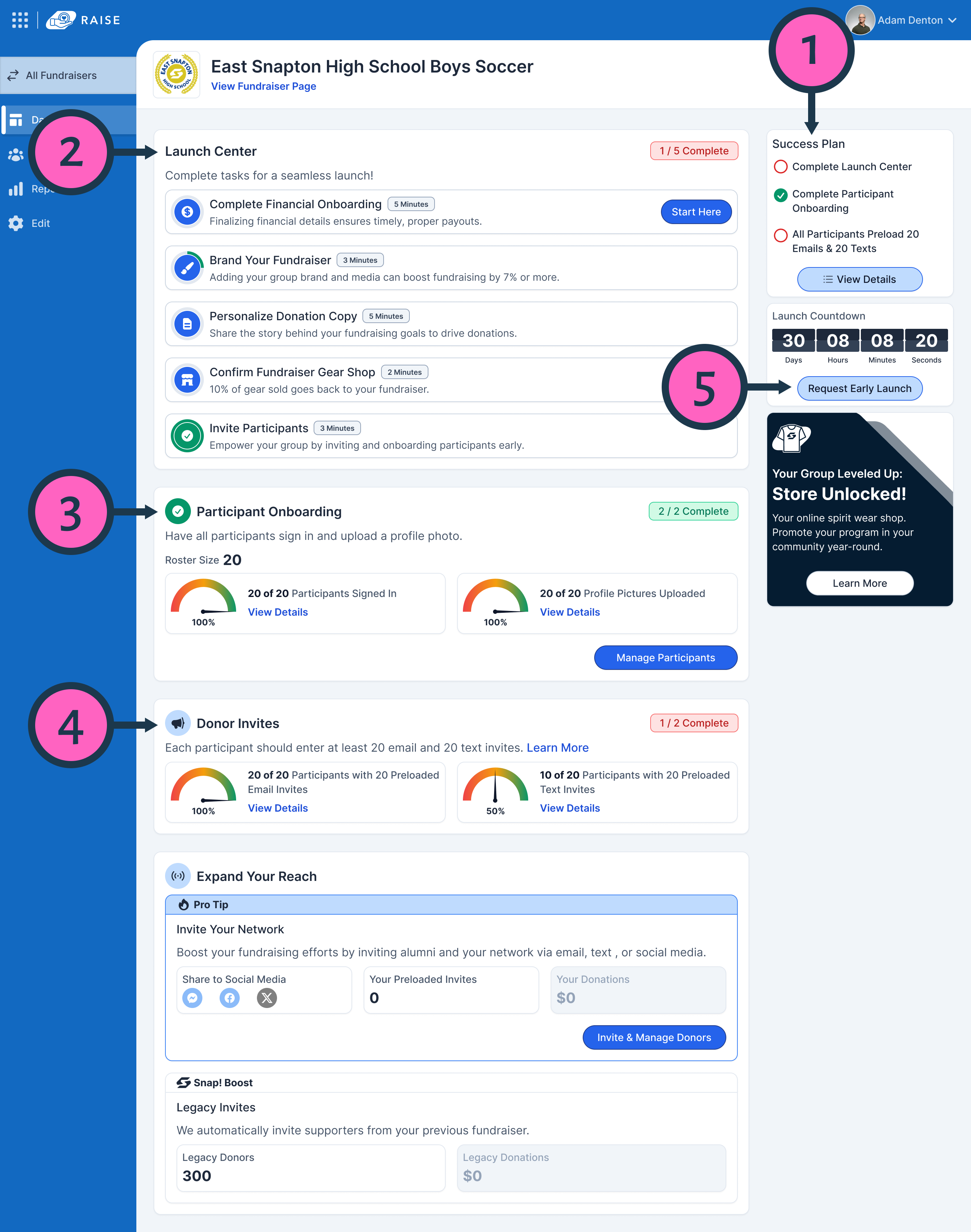
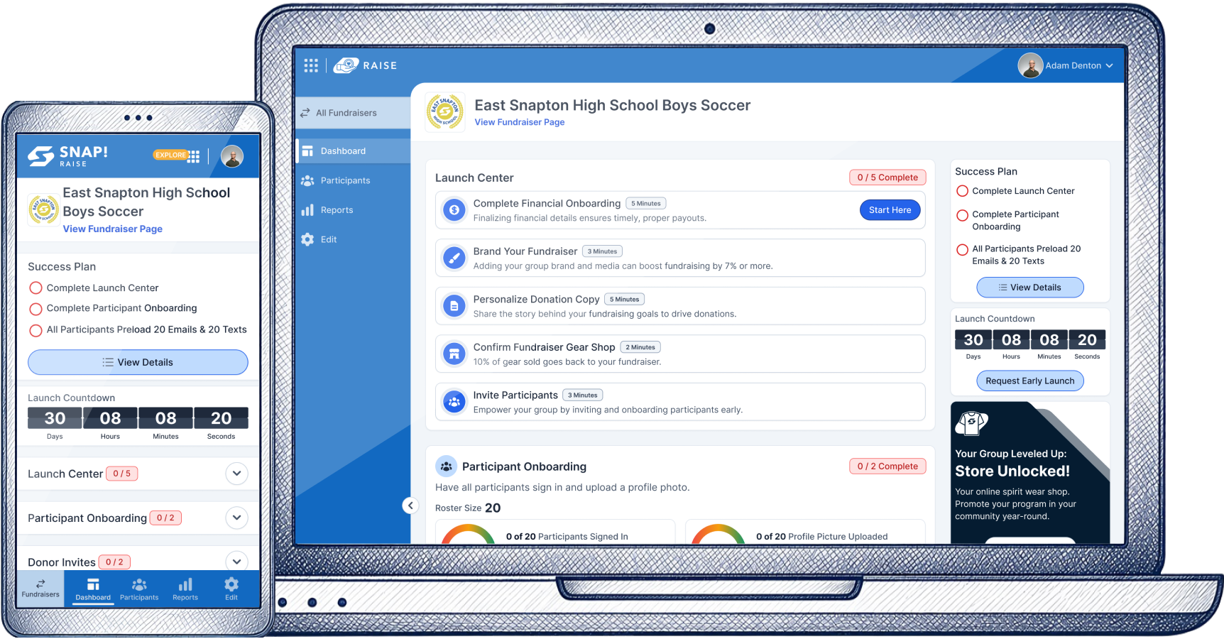
1. Success Plan. The three drivers of a successful fundraiser, tracked in one place: setup, participant onboarding, and preloaded contacts. Progress the GL can see at a glance.
2. Launch Center. Setup broken into five timed tasks, each a few minutes, with Financial Onboarding flagged as the place to start. The hardest step, sized to feel finishable.
3. Participant Onboarding. Sign-ins and profile photos, shown as live completion against roster size. The photo is the trust signal that makes a campaign worth giving to.
4. Donor Invites. The contact base every fundraiser runs on: 20 emails and 20 texts per participant, tracked as real progress toward the target, not a checkbox.
5. Request Early Launch. GLs always wanted to launch early, so finishing the plan unlocked it. The reward they wanted most became the pull that got the work done.
Underneath it was a simple human lever. People want to finish what they start, and they want the checkmark. Every task closed with one, and the plan tracked toward done, so setup stopped feeling like a form and started feeling like progress. The same instinct that made setup feel like busywork now pulled GLs through the work that actually moved money.
A fundraiser is not one screen. It moves through three phases, and what a GL needs changes with it. The old dashboard ignored that, one static page from creation to close. I designed the home to move with the fundraiser, surfacing only the work that mattered in the phase the GL was in.
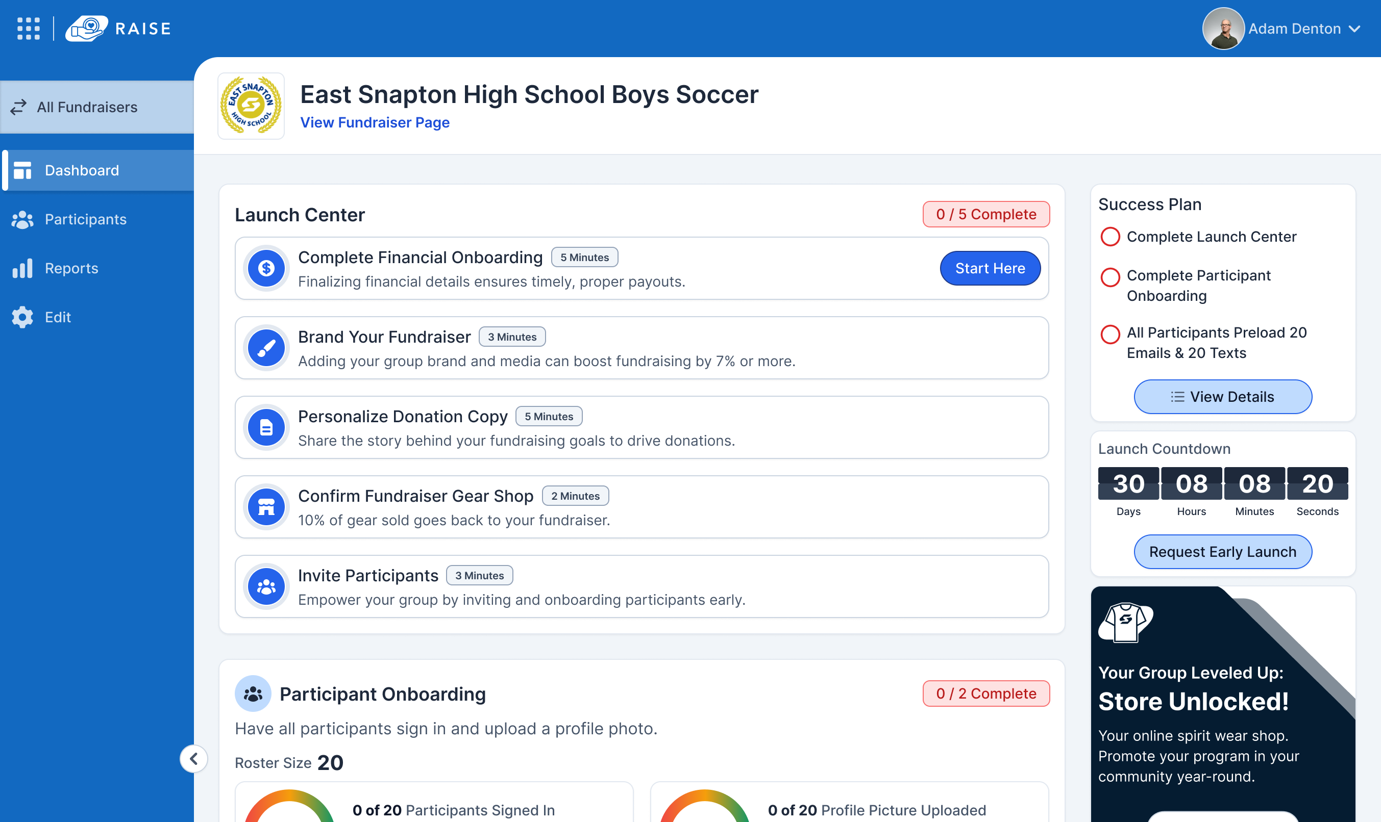
Upcoming: the Success Plan leads, setup through preloading before launch.
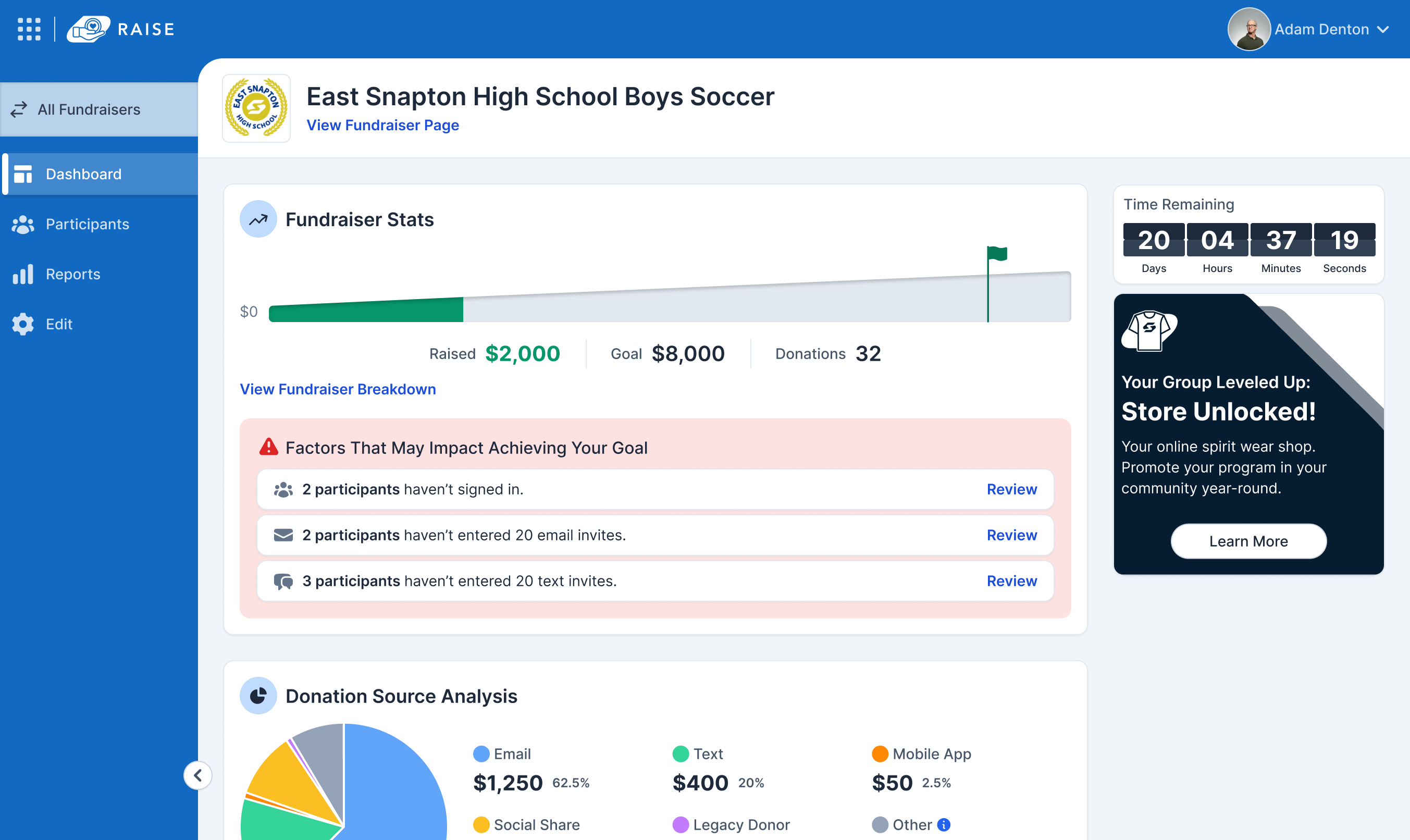
Active: live totals take over, with onboarding and contacts still in reach.
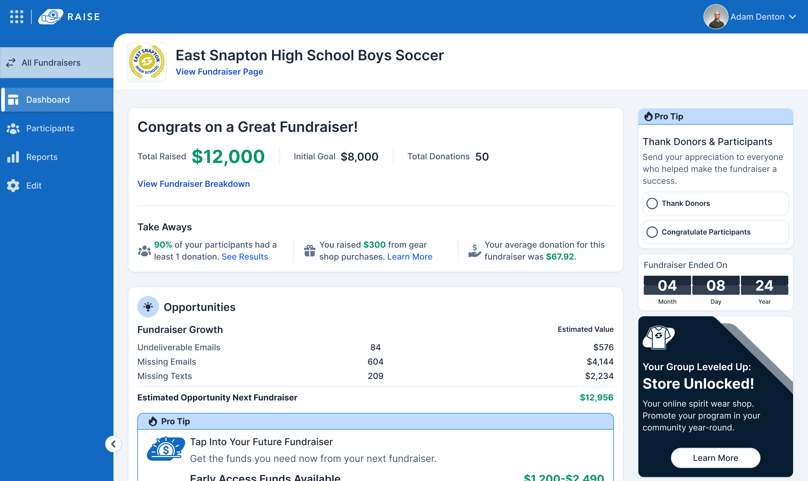
Closed: the wind-down, payouts, gear, thank-yous, and re-signing.
Upcoming was about the plan: get set up, get participants on, get contacts loaded. Active shifted focus to what was being raised, while keeping the onboarding and preloading tasks reachable, since those never had to be finished to launch. Closed turned the fundraiser toward landing it well: getting money distributed correctly, gear mailed to the right places, donors and participants thanked, and the group re-signed for the following year.
Setting up a fundraiser meant clearing its highest-stakes step: the KYB and KYC verification legally required of whoever takes responsibility for the money. It barely worked on the old platform, and partway into the GL work it became its own product, Snap! Vault, serving every Snap platform at once.

Verification, bank details, and terms lived in three disconnected places, and the step meant for the group leader was the one sales completed.

Shared services wanted the simplest rebuild. Raise needed one guided flow. I was the only designer across both and had to strike the balance.

Real money, real compliance, no A/B testing. A silent failure could strand a Group Leader and delay a payment.
KYB and KYC are forms, unavoidably. The bank account step was where the seam would have shown, so that's the one I fought for. I built it into the same chunked, guided pattern as the rest of Raise, so a process another team owned still read as one continuous flow. I didn't win every point, verification stayed a wizard, but I kept the step that mattered.
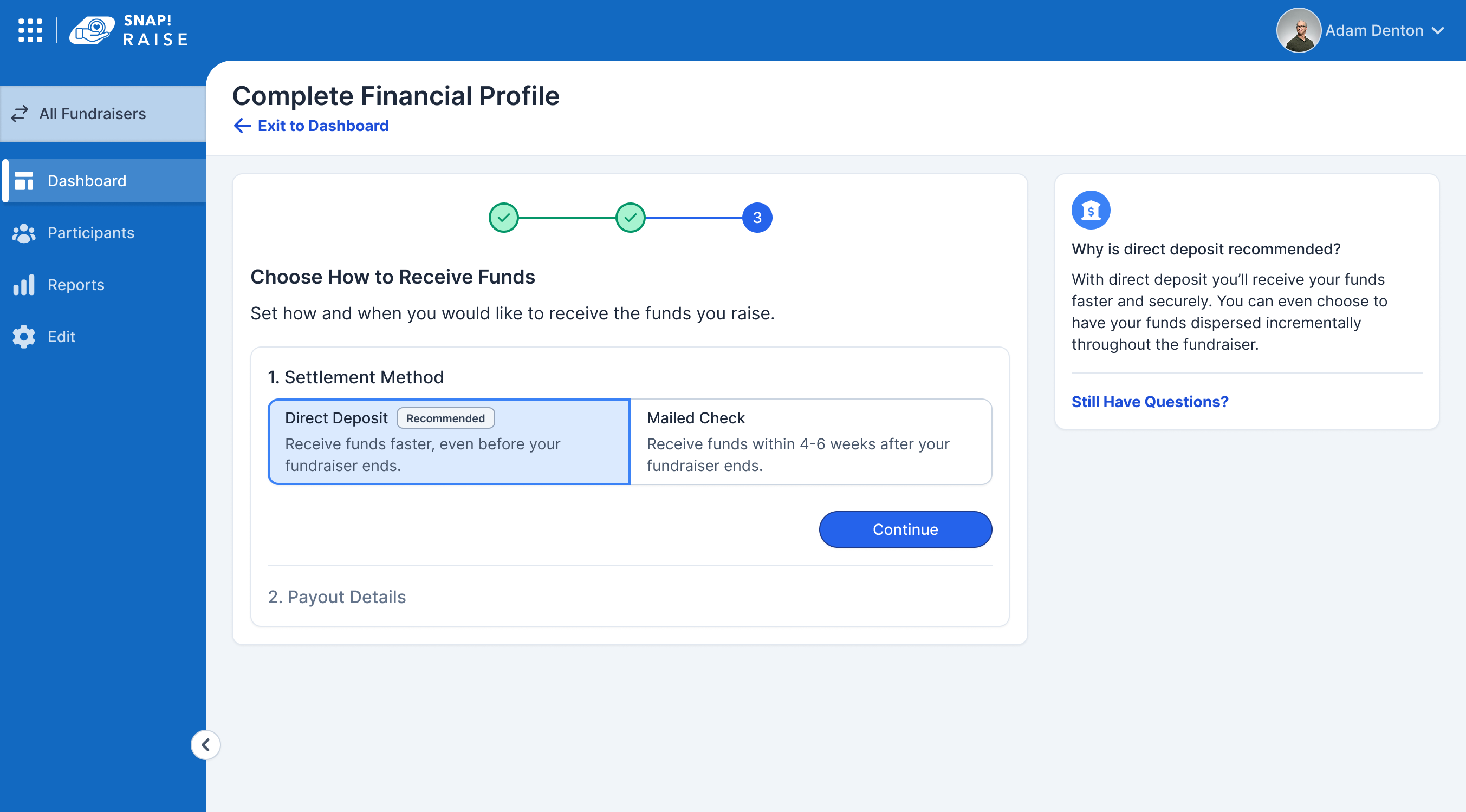
One choice, two payout paths, both built to stay in the Raise flow.
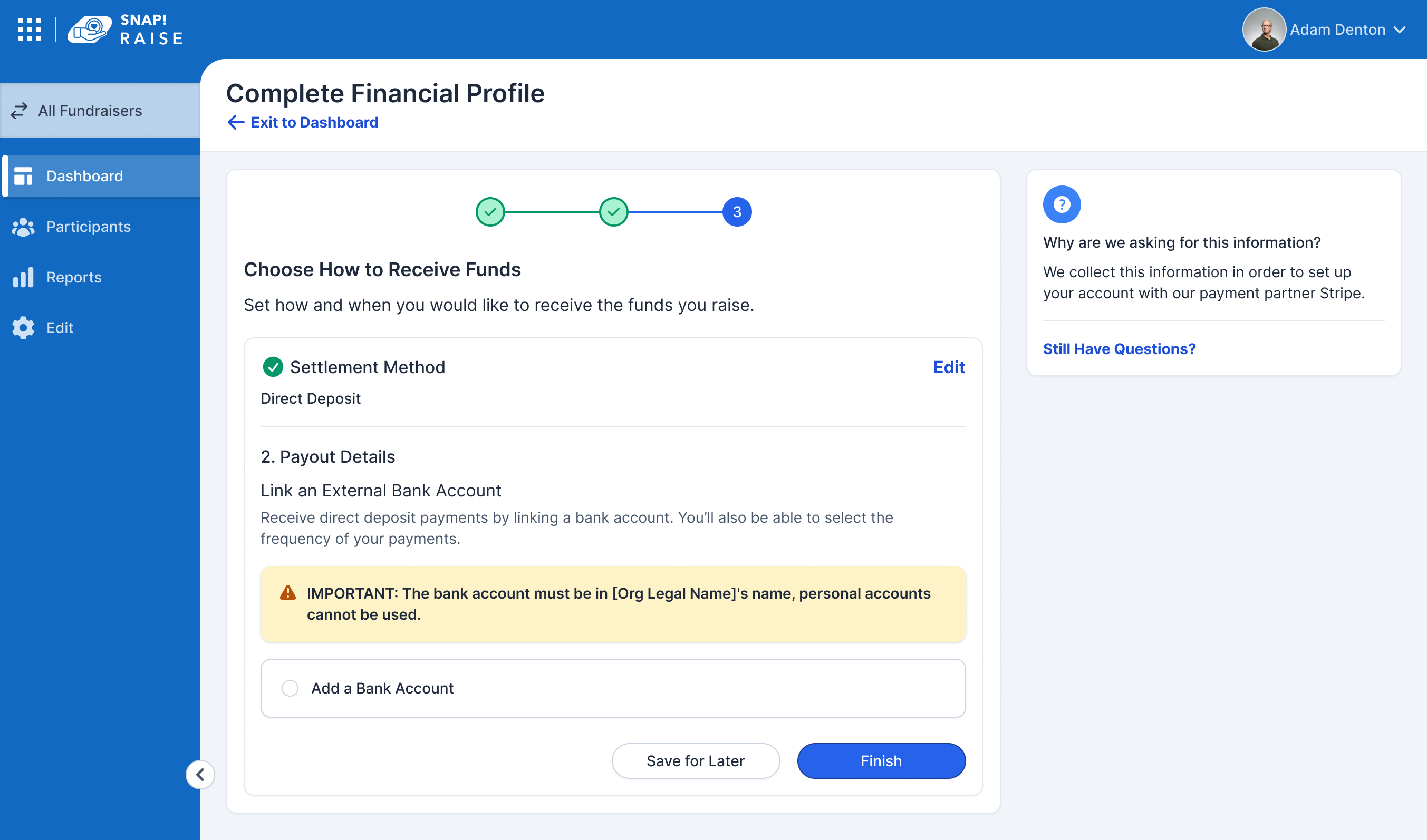
Account setup in the Raise pattern, ours right up to the processor's step.
Completed once at the org level, it covered every fundraiser beneath it. An athletic director set a default account and cleared business verification for all their programs, leaving each group leader a single confirmation before launch. The same profile surfaced across the other Snap products, so one verification carried everywhere.
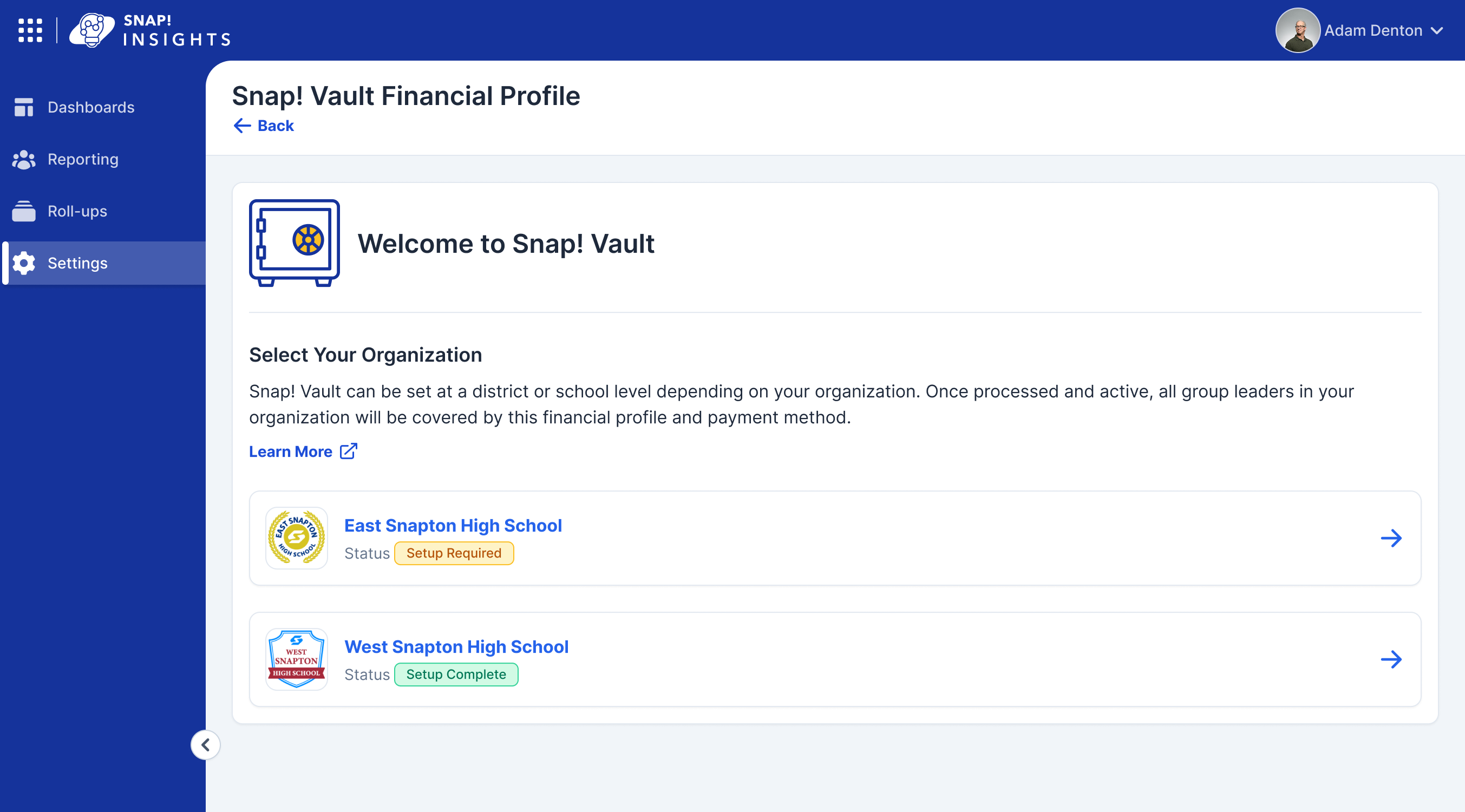
Set once at the org level, inherited everywhere beneath it.
The payment processor could interrupt the flow to demand more, usually proof of identity or of a relationship to the org, and those requests could fail. Because a finished task left the Launch Center, a silent failure would strand a GL with no way back. I designed the path that pulled them to the exact step that needed them.
The redesign moved the top of the funnel off sales and onto the people who owned it, without giving anything up.
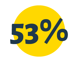
53% completed the hardest task alone. More than half cleared financial verification in one session, the step sales used to own. The rest finished it across visits, the save-and-return design working as intended.

1 in 10 finished the entire setup in one sitting. A tenth cleared every task at once, under ten minutes, behavior we had not designed for and did not expect.
13+ minute average sessions. GLs stayed engaged with the dashboard across the fundraiser's whole life cycle, not just at setup.

Sales stepped out entirely. Confidence in the self-service flow grew enough that reps were removed from completing setup at all, freeing them to chase new schools and orgs instead of filling out forms.
The room's instinct was to cut setup down. The fix was to keep the complexity and break it into pieces a coach could finish between a class and a practice. When the work is genuinely hard, chunking beats trimming.
Vault worked because one person held a single pattern across two teams and the products that consumed it. The seamlessness a GL never noticed was the whole job.
We shipped a cleaner setup and thought we were done. The work that actually moved money was the work no one had named yet. Getting there meant being told we had solved the wrong thing, and going back.